Colors attract, and texts speak. Robert Southey said, “If you would be pungent, be brief; for it is with words as with sunbeams—the more they are condensed, the deeper they burn.”
Every UX writer understands how important it is to get the right words the very first time. With the words though, there must be an appropriate design, a mix of colors and fonts. Webpages could have different themes, from homesteading to scholarship writers.
What is UX writing?
Quickly, let us describe what UX writing is. Wikipedia defines it as a professional activity of writing texts for user interfaces, both web, and mobile. It includes creating texts from small labels of buttons and icons to taglines, error messages, notifications, navigation prompts, and instruction guidelines.
When users visit a webpage the first time, and they are not impressed, the impression is once embedded, and they may never come back there. It doesn’t matter how engaging the words are or how well crafted if the words look terrible on the webpage users will never come again. If the words speak, but the colors don’t attract, the delivery is lost. Collaborating with a SaaS web design agency can ensure the website’s design and content are optimized to attract and retain users.
This is the problem for UX writers: they are not web designers. Poor design will make even the best-crafted words fall flat and come off colorless. To succeed in the business of attention-grabbing, a UX writer needs to go further and get comfortable with visual designing.
Let us examine some tips to get better results.
Don’t Botch the Colour
Most webpages have a combination of texts and visual images carefully placed on top of each other. This means; there is a text, below it a box, in that box, there is an image that is a visual interpretation of the texts above it. Now, to optimize the effect of this combination, careful use of colors is important.
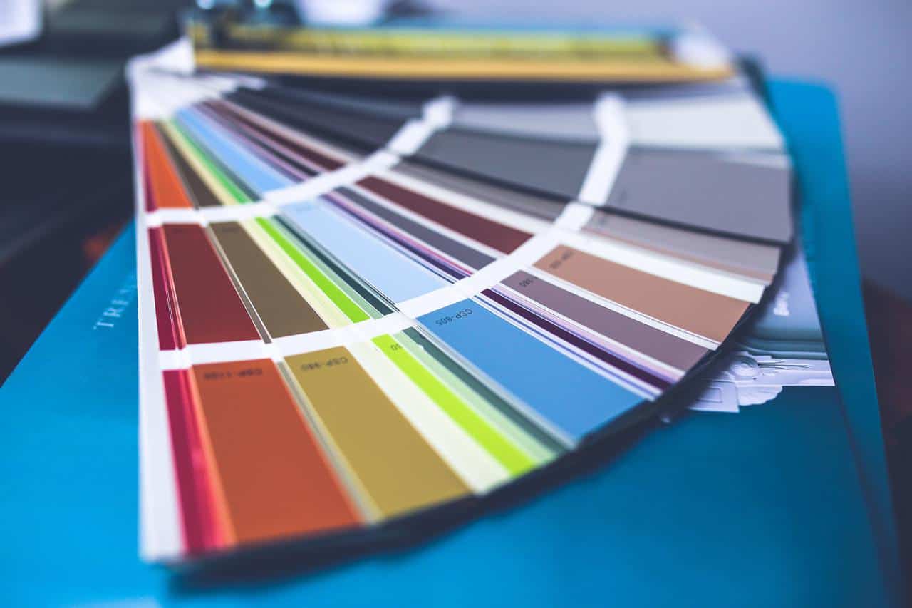
A webpage must make good use of wide space to draw the attention of users. While there are cool colors, the copy that matters most here is the header. A nicely structured webpage, with thoughtfully selected colors, appeals to readers more.
Arrangements and Proportion: Symmetry
It is important to maintain symmetry when organizing the webpage and writing a UX. A lot of UX writers do not care for this. But it is as important in the interface as every other principle. The human brain is lazier than you think. It takes just a glance for interest to be lost entirely. We all experience this on the internet, without knowing it.
If you have several items you want to include on the webpage; services, features or benefits, do not list them in a vertical text form as your audience may find it boring. Using a multi-column element with graphics is your best option- it makes everything tidy and easy to the eye. Everything will be on point; illustrations, Header text, subheaders, and explainer text. It registers in the mind of the audience easily.
How many revisits your webpage will get is a lot based on how well proportioned it is. That possibility reduces if your webpage is unsightly. Ensure your opening text is not too long. A wordy opening text constitutes a distraction for users.
Split Your Paragraphs
Having too much information in one paragraph is not good. In fact, the paragraph will appear so lengthy that the reader will rather just skip to the end. It happens to all of us. No one wants to read a lengthy paragraph. Most times, it may be as a result of being verbose too. A paragraph may carry just one information, but too many words may have been used to narrate or define a concept.
Rather than lumping the whole idea is so many texts, it is better to split it into smaller bits. Never let a paragraph run for more than five lines on a webpage. Readers lose focus when there is too much to read at once. Using the arrangements we mentioned earlier, paragraphs can be broken down to readable units.
 Imagine telling a company’s story. There can be just two paragraphs of the story before it is broken by a creative element and then followed by another paragraph. Since the human mind perceives things pictorially more often than not, readers will find the page enlightening and enjoyable at the same time.
You can decide to use bullet points too. Although using bullet points is not a bad idea, bullet points that are too long are a turnoff. The bold font is important also. The fonts should be properly sized; not too big that it is overwhelming and not too small that it becomes too difficult to read. Please use a readable text style also.
Make Header Tags Brief
Header tags are important for webpage and blog posts. They are an essential part of the whole landscape. However, caution should be applied when writing a header tag. Avoid the temptation to include all the ideas in one tag. The advantage of a short header tag is that readers can scan the webpage and get what the page is about without reading. If you use a suitable header, Google bots can pick on your header tag and rank it according to how it matches the majority of user queries.

There is something poetic about a short header tag. A short header tag on a webpage passes the message succinctly. The terser a header, the better. The header should have enough information to attract the reader, but it should not do more than that.
Write as many drafts as possible till you get the right one. Use a few days to rewrite the header tag. Remember that using proper grammar is very important. Wrong spelling or grammar on your webpage is a sign of unprofessionalism.
Finally, UX writing should be a collaboration between the writer and the designer. It is the job of the writer to determine how much text is on the webpage, but as the foregoing has shown, working alone does not always deliver the best results.