A logo is the real face of a company. A business can’t get ahead in the game unless it has a logo and name. It’s not a piece of cake to come up with insightful thoughts. All you need to do is to make it visually appealing; you’ve to figure out a way to set apart yourself from competition and become unique. This the time to get rid of frustration and these are the five ways to make your logo design stand out:
- It Should be Memorable.
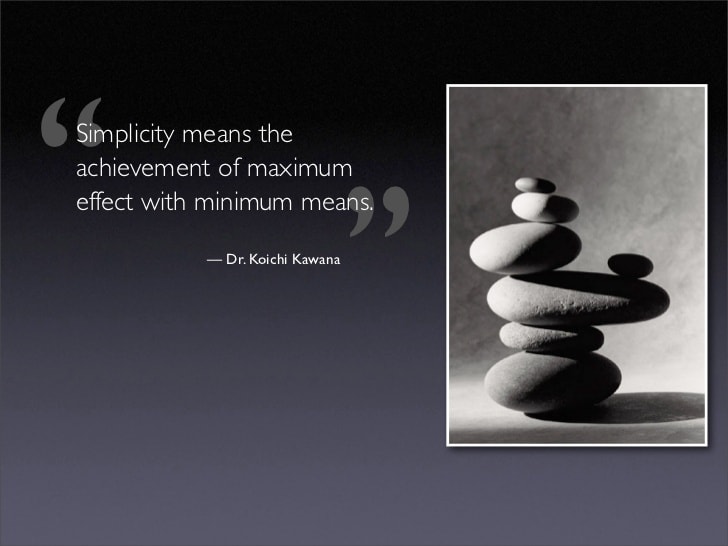
- Simplicity is the Best Policy
- Adaptability is Creativity
- Typography Matters Most
- Your Brand is Your Message
It Should Be Memorable
A perfect logo design should be memorable. People might forget about you, your product or services. One thing that nobody forgets for sure is your logo. A name and logo contribute invariably towards the recognition of the brand. There are lots of ways to create catchy names and designs for your brand. It’s better to sketch out a marketplace where you want to establish a business. If your goal is to go global, then make sure it’s easy-to-pronounce, and design should be easily understandable. A design swamped with itchy colours and textures put off clients from coming back to you, and if the visual aspect isn’t your biggest strength, reaching out to a brand design firm is your best bet.
Once, you’ve decided the logo of your logo, then stick to it religiously. Look at the examples of Coca Cola and McDonald’s, both of these brands need no introduction, but they had to the dedicated perceivable amount of time in getting themselves known in the targeted audience. Likewise, you will have to play your game to become the talk of the town and logo design is your number one aide in your journey.\
Simplicity is the Best Policy

A simple logo always inspires people. Why? Does it sound strange to you? It’s the simplicity of Apple’s logo design, or FedEx’s that people don’t have difficulty at all in identifying them in herds of other similar services. Similarly, you won’t expect your brand to die in irrelevancy, just because your logo design is overwhelmingly creative. You have used colours abruptly, or your font selection is off-putting.
Keep your logo design simply because it’s easy to remember and people don’t find it hard to recall your name and logo design at the time of need. Take the example of Nike, It’s completely simple and unfolds the phenomenon of ‘Simplicity is the best policy’ successfully.
Adaptability is Creativity
 Believe it or not, versatility is creativity. Your logo should be well-fitting. Either it’s vertical or horizontal, your web design should look good everywhere. It has to be accommodating on all shapes and sizes of billboards. The logo should be versatile. Colour psychology plays a critical role in customers’ engagement and persuasion. So, keep colours and fonts in mind while getting your logo design made, because it’s a culture which matters most for business. Let’s say; you’re planning to build your real estate company in Dubai, then, it will be better to use these colours in logos such as Black, Green, Red, and white. Or, you should hire a professional Branding design company UK to get this job done at creatively.
Make sure your logo design is meaningful, balanced and easy to understand. And, adaptability is the key to the brand’s success.
Typography Matters Most
Typography matters most in the whole logo designing process. Like colours, fonts do play a crucial role in getting people to come across your message. That’s why; people don’t just remember colours; they do look for typography. Fonts release different vibes. For example, Script Typeface is an excellent choice for businesses such as the gaming arena, but for businesses such as hospitals, it’s better to use Sans-Serif due to its round edges. So, be careful when you’re choosing fonts for your design logos.
The right font conveys a clear message of your brand to your clients. So, make sure to choose carefully.
Your Brand is Your Message
A brand represents your message. Do you want to look serious, relaxed or casual in your dispositions? Or, do your brand sound feminine or give masculine feel? Maybe, it caters to specific niche and industry. So, it’s inevitable for you to be thoroughly familiar with the company’s message and ensure that your logo correctly represents it. The best thing is to look at your competitors. It helps evaluate how to stand out among them.
Final Wrap Up
Make your logo design memorable, simple, adaptable. Your brand should convey your message. Typography matters most. Don’t miss this opportunity, get the support of experts onboard to get rid of anonymity. Get your logo designed right away and become the next big company which helps targeted audience solve their problems with ease.
