If you want your online store to be successful, you need to focus on making it as user-friendly as possible. Creating the ideal online store might sometimes be challenging, but making it easy to navigate through pays off in the end.
Online shoppers have a short attention span and not lots of patience. It’ll only take them a few seconds to scroll through something they don’t find interesting. Recent studies show that the attention span of an average person has dropped from 2 and a half minutes to 45 seconds over the last 20 years.
This means that your site should be more focused than ever on grabbing the user’s attention quickly. In this article, we’ll dive deeper into learning more about how you can create a user-friendly online store.
-
Use language service providers

You have no idea how important language service providers (LSP) are for your website. LSP serves different types of clients that include audiovisual content. This means that if you are showcasing your product through a video, you definitely need to get help from LSPs. Subtitling for language service providers is easy and depending on which LSP you are using, many of them offer support in many languages and dialects.
There are AI-generated and human-made subtitling, transcription and localization services. Otherwise, LSPs also help in proofreading your subtitles, especially when they are in larger volumes and have tight deadlines.
Statistics show that around 18% of the world’s population speaks English, so using transcription services for your online store’s website is highly important if you want to reach a larger audience.
-
Use high-quality images
Presenting your products with high-quality images and good product descriptions can significantly help in grabbing your visitor’s attention and helping them make a better purchase decision.
When someone visits your website, there’s nobody who can convince your visitors what is right for them, but building good product pages that are user-friendly and persuasive can do this. Make sure your images are high-quality and have good lighting. Adding a set of images to showcase all of the product features is the best practice you can follow. Also, don’t forget to add a product description.
Furthermore, another great feature to include is to provide zoom-in functions that allow all of your visitors to closely view your products.
-
Get help from a UX research agencies
UX research is vital in the product development phase, addressing user’s needs, pain points, and behaviors. UX research agencies offer many services that can fit your website’s needs. Before you choose which agency to hire, it’s important to weigh the advantages and the disadvantages of hiring one.
For example, to help you get started, we’ve come up with a list of UX research agencies in the US. We are going to list the company’s size, price, and what they specialize in. This is to give you an idea of what you should pay attention to when choosing to hire a UX research agency in your local area.
| Name | Company Size | Price | Specialties |
| Hubble | 1-10 | Has a free plan
Custom pricing options |
Usability testing
Surveys Recruitment panel |
| Answer Lab | 100-250 | Pricing is only available upon request | Usability testing
Consulting Training |
| Guidea | 10-50 | Pricing is available upon request | FinTech
Consulting Health Tech |
| Gartner | 10,000 – 20,000 | Only available upon request | Strategic planning
Product design Audit Risk |
The UX research agency that will fit your design requirements will depend on what it specializes in. Also, a general tip to follow is to make sure that you compare the prices of each agencies plan. Some agencies might offer the same qualities but differ significantly in price.
-
Display trusted payment options

Displaying trusted payment options is an excellent way of showcasing how trustworthy your online store is. Trusted secure payment option icons prove to customers that you are trustworthy and don’t make them think twice about sharing their sensitive information such as bank details.
92% of consumers will trust positive online reviews as much as personal recommendations, so once customers have a good experience with the product, they’ll start recommending it to others as well.
-
Have accessible navigation
If your homepage looks like a mess, visitors will most likely get confused and leave your website. The last thing you want to happen is to have your bounce rate go up.
Also, don’t sell thousands of products that your customers might not find interesting, but ones that can actually sell. What’s the result of having too many choices? Most likely, it ends up in making a bad choice, something you don’t want the customer to make.
Include your main categories in the header so your visitors can quickly find their products. Open navigation reduces the number of clicks required to reach the final outcome. That is exactly what you are aiming for.
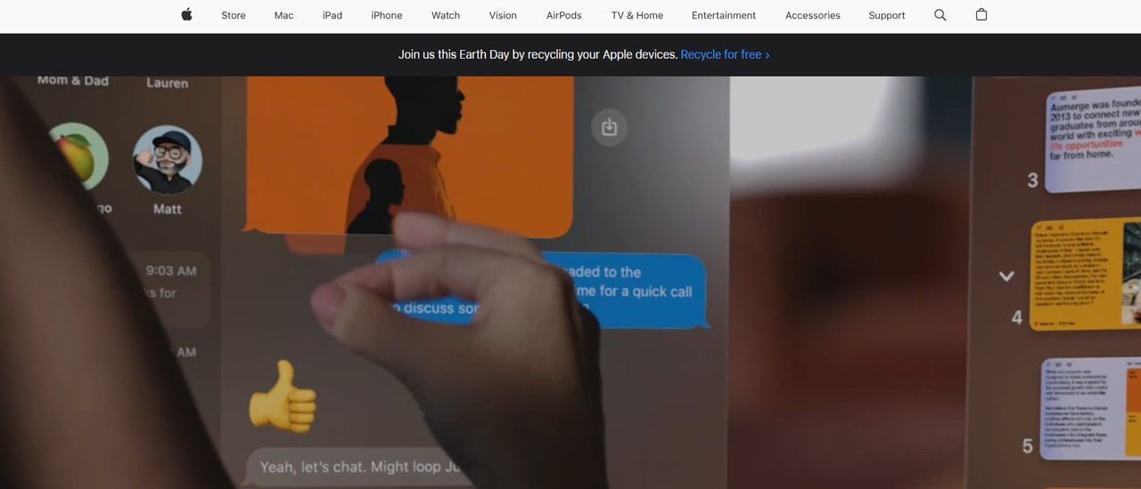
Additionally, consider using drop-down menus to allow you to reveal more options for your customer. Don’t forget to make your categories and subcategories clear and logical. A perfect example we came up with is Apple’s website. You can see that each category is cleanly placed and visible, and has a big ad in the middle. Nothing seems complex, and navigation is accessible and easy to learn.
-
Make your call-to-actions (CTAs) clear
A CTA is a button or link that tells visitors what action you want them to take. Popular CTAs include “Sign Up’’, ‘’Add to Cart”, “Buy Now”, “Subscribe”, etc. CTAs are really important and need to be visible throughout your website. They need to stand out from the rest of the page and use clear language.
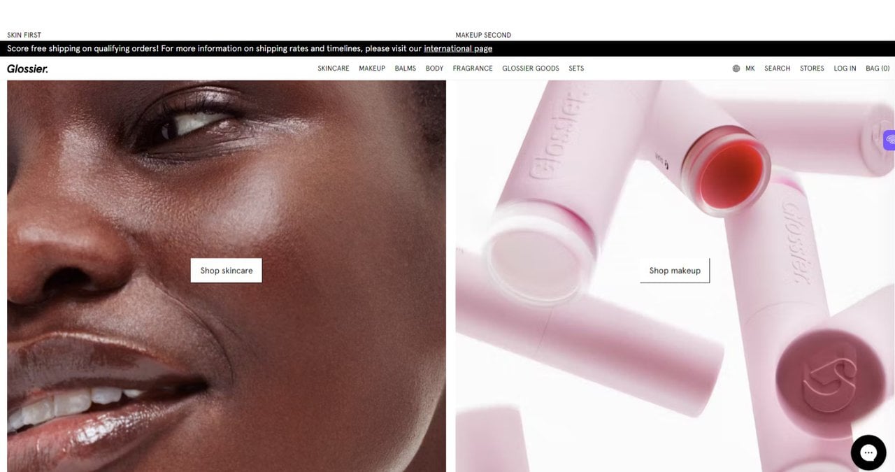
We came up with a good example below from Glossier. You can clearly see that they included a high-quality image in the background and included the CTA in the middle in white. Not only is it clear to see, but it is in an ideal position that makes it impossible for the visitor not to see.
-
Optimize your website’s speed
Fast-loading websites are important if you want to reduce bounce rates and keep your users engaged. Compress your images without reducing their quality, and minimize scripts and codes. Image compression tools can help you get the job done. Here are some we recommend for you:
- ShortPixel
- Uploadcare
- TinyImage
- Adobe Photoshop
- ImageOptim
Furthermore, you can distribute your website’s content across multiple servers by using a content delivery network (CDN) and improve the overall performance of your site.
The most recent statistics show that the ideal website loading time for a mobile site is anywhere between 1-2 seconds. Anything above three seconds will increase bounce rates, so always aim to make your website load in under three seconds.
-
Analyze user behaviors
If you always monitor and analyze user behavior, you can easily identify usability issues and areas where you can improve your online store. Take advantage of tools like A/B testing, UX audits, and heatmaps to learn more about how users interact with your site, and identify the pain points, roadblocks, and areas of confusion.
Through heatmaps, you can understand more about which area of the website your users are interacting with the most. This is crucial if you want to get a clear picture of where you want to place important elements such as call-to-actions, product images, and promotional banners.
On the other hand, we have A/B testing, which is used for comparing multiple versions of a product, design, or prototype. Metrics used in A/B testing are micro and macro conversions. It’s a low-cost option and shows you which version is better for you. A/B testing is used by many large websites like Google that are known to always be testing.
Finally, we have the UX audit, which shows how easy it is for users to interact with your site or app. It views your website or app from a user’s perspective. Audits will measure user satisfaction based on interface design, performance, accessibility, and usability.
Let’s not forget that UX audits are great for improving your rankings on search engines. UX audits will evaluate your website’s information architecture, navigation, and the way you structure your content. Well-organized sites that are user-friendly will always be easier for search engine crawlers to index them. This not only impacts your search ranking but your website’s visibility too.
Everyone is looking for a user-friendly website to shop on
Creating a user-friendly online store requires close attention to detail, and an in-depth understanding of what the user is looking for. As we said before, if you think that is too challenging, you can always get help from UX research agencies that will show you the steps to creating a user-friendly website.
There is no real definition of a user-friendly online store, but it all depends on the user’s perspective. We have showed you the steps on how you can create one, but at the end of the day, always analyze the user’s behavior. Pay close attention to your heat map, A/B testing, and UX audits. These will help you have a much more successful outcome.
About The Author:
Tony Ademi is a freelance SEO content and copywriter. He has been in the writing industry for four years and has managed to write over 600 SEO-optimized articles; Many, which have ranked #1 on Google. Tony’s primary concern when writing an article is to do extensive research and ensure that the reader is engaged until the end.