
Your email signature is often the last thing people see after reading your message, but it can leave a lasting impression. A polished signature—with the right name, title, contact details, logo, and social links—helps reinforce your professionalism. Yet one detail is frequently overlooked: the font. Choosing a good font for an email signature improves readability, supports your brand identity, and ensures your signature looks consistent across devices and email clients.
TLDR: The best fonts for email signatures are clean, readable, and widely supported across platforms. Safe choices include Arial, Verdana, Georgia, Tahoma, and Calibri. Avoid overly decorative fonts, tiny sizes, and too many typefaces in one signature. For the most professional result, choose a font that matches your brand while staying easy to read on desktop and mobile.
Why Font Choice Matters in an Email Signature
An email signature is more than a sign-off; it is a compact branding tool. It can communicate credibility, attention to detail, and personality within just a few lines. The font you choose affects how quickly someone can scan your contact information and how professional your message feels.
A beautiful but hard-to-read font can create friction. If a recipient has to squint to find your phone number or job title, your signature is not doing its job. Likewise, a font that does not display correctly in certain email clients may be replaced by a default font, making your carefully designed signature look inconsistent.
The goal is to find the right balance between readability, compatibility, and brand expression. A great email signature font should look clean at small sizes, work well across major email platforms, and complement your company’s visual identity.

What Makes a Font Good for Email Signatures?
Before choosing a specific font, it helps to understand the qualities that make a typeface suitable for email signatures.
- Readability: The font should be easy to read at small sizes, especially on mobile devices.
- Cross-platform compatibility: The font should be commonly available on Windows, macOS, iOS, Android, and major email clients.
- Professional appearance: It should suit your industry and the tone of your communication.
- Brand consistency: The font should align with your website, business cards, presentations, and other brand materials.
- Clean structure: Simple letterforms are usually better than decorative or script styles.
In most cases, web-safe fonts are the smartest choice. These are fonts that are preinstalled on most devices, reducing the risk of your signature appearing differently to recipients.
Best Professional Fonts for Email Signatures
1. Arial
Arial is one of the safest and most widely used fonts for email signatures. It is clean, neutral, and highly readable. Because it is available on nearly every device and email client, it helps keep your signature consistent.
Arial works especially well for corporate, technology, finance, and professional services brands. It may not be the most distinctive option, but its reliability makes it a strong default choice.
2. Verdana
Verdana was designed for screen readability, making it excellent for email. Its wider letter spacing and large x-height make it easy to read even at smaller sizes.
This font is a great option if your signature includes several details, such as a title, phone number, website, and social links. Verdana keeps information clear and accessible without feeling cramped.
3. Tahoma
Tahoma is compact, modern, and highly legible. Compared with Verdana, it takes up less horizontal space, which can be helpful in signatures with multiple lines or narrow layouts.
It is a particularly good choice for business owners, consultants, and teams that want a practical font with a slightly sharper look than Arial.
4. Georgia
If you prefer a serif font, Georgia is one of the best choices for email signatures. Unlike many traditional serif fonts, Georgia was created to read well on screens. It feels professional, elegant, and trustworthy.
Georgia is ideal for legal firms, editorial brands, universities, consultants, luxury businesses, and anyone who wants a more classic tone. It pairs nicely with restrained colors and minimalist layouts.
5. Calibri
Calibri became familiar through Microsoft Office, and many people associate it with modern business communication. It has soft curves, good readability, and a friendly professional style.
While Calibri is widely supported, it may not display identically everywhere, especially outside Microsoft environments. Still, it remains a strong and familiar option for many business signatures.
6. Helvetica
Helvetica is a favorite among designers because of its clean, timeless appearance. It communicates simplicity, confidence, and modernity. However, Helvetica is not available on every system, so it is best used with fallback fonts such as Arial or sans-serif.
For example, a font stack might prioritize Helvetica but allow Arial to appear if Helvetica is unavailable. This gives you a polished look while maintaining compatibility.
Sans Serif vs. Serif: Which Is Better?
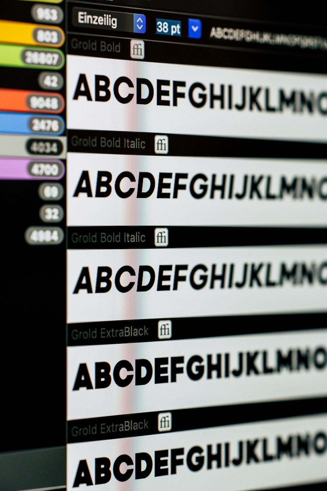
Most email signatures use sans serif fonts such as Arial, Verdana, Tahoma, or Helvetica. Sans serif fonts do not have the small finishing strokes found in serif fonts, which often makes them cleaner and easier to read on screens.
However, serif fonts are not off-limits. A well-chosen serif font like Georgia can add authority and sophistication. The best option depends on your brand personality. A software company may prefer a sleek sans serif font, while a law office or publishing consultant may benefit from a more traditional serif style.
As a general rule, prioritize clarity first and personality second. Your email signature should never feel like a design experiment at the expense of usability.
Recommended Font Sizes for Email Signatures
Font size is just as important as font style. If your signature is too small, it becomes difficult to read. If it is too large, it can look unbalanced or distracting.
- Name: 14–16px, often bolded for emphasis.
- Job title and company: 12–14px.
- Contact details: 11–13px.
- Legal disclaimers: 9–11px, but still readable.
For most professional signatures, a body text size of 12px to 14px works well. Your name can be slightly larger to create hierarchy, while secondary details can be smaller.
How to Match Your Font with Your Brand
Your email signature should feel connected to the rest of your brand. If your website uses a modern sans serif font, your signature should probably follow that direction. If your brand is refined, traditional, or premium, a font like Georgia may be more appropriate.
Think about the qualities you want to communicate:
- Modern and minimal: Helvetica, Arial, Tahoma.
- Friendly and approachable: Calibri, Verdana.
- Classic and trustworthy: Georgia.
- Corporate and neutral: Arial, Calibri.
Color also plays a role. A simple black or dark gray font is usually best for readability, while one accent color can be used for your name, company, or links. Avoid using several bright colors, as they can make your signature look cluttered.
Fonts to Avoid in Email Signatures
Some fonts may look fun in a poster or invitation but perform poorly in a professional email signature. Avoid fonts that distract from the information or fail to display reliably.
- Script fonts: They can be hard to read and may look unprofessional in business communication.
- Decorative fonts: Novelty typefaces often reduce credibility.
- Very thin fonts: These may disappear on mobile screens or low-resolution displays.
- Custom fonts without fallbacks: If unsupported, they may be replaced unpredictably.
- All caps for everything: This can feel aggressive and reduce readability.
It is also best to avoid mixing too many fonts. One font is often enough. If you use two, keep one for your name or headline and another for supporting details.

Practical Email Signature Typography Tips
Good typography is not only about the font itself. Spacing, hierarchy, and formatting can make your signature easier to scan.
- Use bold strategically: Bold your name or company, not every detail.
- Keep line spacing comfortable: Crowded text looks messy and is harder to read.
- Limit italic text: Italics can be useful for a short tagline, but too much reduces clarity.
- Test on mobile: Many recipients will read your message on a phone.
- Use fallback fonts: A backup font ensures your signature still looks good if the first choice is unavailable.
A simple example of a reliable font stack is: Helvetica, Arial, sans-serif. Another safe option is: Georgia, Times New Roman, serif. These stacks give email clients alternatives while preserving the general style.
Final Thoughts
The best font for an email signature is one that quietly does its job. It should make your name, role, and contact details easy to read while reinforcing your professional identity. For most people, Arial, Verdana, Tahoma, Calibri, Helvetica, and Georgia are the strongest choices.
If you are unsure, start with a clean sans serif font, keep the size between 12px and 14px, and use bold formatting only where it adds clarity. A well-designed email signature does not need to be flashy. It simply needs to be readable, consistent, and aligned with your brand every time you press send.