
A business card is tiny. But it can do big work. It can say, “Hello, I am real.” It can say, “Call me.” It can also say, “Yes, I do have my act together.” The trick is making a card that looks great on screen and also prints well on paper.
TLDR: Business card creation tools help you design cards without needing to be a pro designer. The best ones give you print-ready files with the right size, bleed, resolution, and export settings. Look for templates, easy editing, logo support, and PDF download options. A good tool saves time, stress, and awkward cards with chopped-off text.
Why Print-Ready Matters
A design can look perfect on your laptop. Then it can print badly. Ouch.
Maybe the edges get cut off. Maybe the text is too close to the edge. Maybe the colors look dull. Maybe your logo turns fuzzy. These problems are common. They happen when a file is not set up for printing.
A print-ready business card file is built for a printer. It has the right size. It has sharp images. It includes bleed. It keeps important text inside the safe zone. It usually comes as a high-quality PDF.
Think of it like packing a suitcase. A print-ready file has everything the printer needs. No missing socks. No mystery cables. No panic at the airport.
What Business Card Tools Do
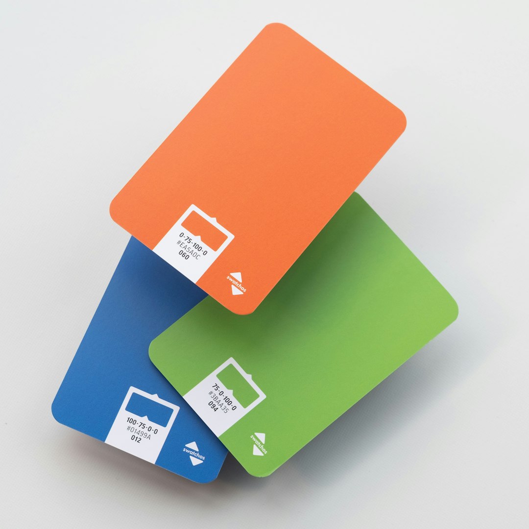
Business card creation tools are online apps or software that help you build a card fast. You pick a template. You add your name. You add your logo. You change colors. You move things around. Then you download the file.
Some tools are super simple. Some have more advanced options. Both can be useful. The right choice depends on your needs.
If you need a card today, a template tool is great. If you want full control, a design tool with advanced settings is better. If you have a brand guide, choose something that lets you upload fonts, logos, and exact colors.
Features That Make a Tool Worth Using
Not every tool is a winner. Some look fun but give weak print files. That is like buying a cake that is all frosting and no cake.
Here are the features to look for:
- Correct card sizes: Common sizes include 3.5 x 2 inches in the United States. Other countries may use different sizes.
- Bleed settings: Bleed is extra design space around the card. It gets trimmed off after printing.
- Safe zone guides: These show where your text should stay. They help stop cut-off phone numbers.
- High-resolution exports: Choose 300 DPI when possible. This keeps images crisp.
- PDF download: A print-quality PDF is often the best file for printers.
- Logo upload: A sharp logo makes your card look professional.
- Easy text editing: You should be able to fix typos fast. Because typos love business cards.
- Front and back design: Two sides give you more room to shine.
The Magic Words: Bleed, Trim, and Safe Zone
Printers use a few terms that sound fancy. They are not scary.
Bleed is the extra area around your design. If your background color or image goes to the edge, it must extend into the bleed area. This avoids thin white lines after cutting.
Trim is where the card gets cut. This is the final edge.
Safe zone is the area inside the trim line. Keep names, phone numbers, emails, and QR codes in this space. Give them room to breathe.
Here is the simple rule. Backgrounds go past the trim. Important stuff stays away from the trim. Your future self will thank you.
Templates Are Your Friend
Some people hear “template” and think “boring.” Not true. A good template is like a good pizza base. You still pick the toppings.
Templates help with spacing. They help with balance. They give you a clean starting point. You can change colors, fonts, icons, and layouts. You can make it feel like you.
For best results, choose a template that matches your business style. A bakery might use warm colors and soft shapes. A tech consultant might use clean lines and sharp contrast. A dog trainer might use playful icons. Yes, dog paw prints are allowed. Use them wisely.
Colors Can Be Tricky
Colors on screens are bright. Screens glow. Paper does not glow. Sad but true.
Many printers use CMYK color. Screens use RGB. Some design tools let you work in CMYK or export files that are better for print. This helps colors stay more predictable.
If your exact brand color matters, check the tool’s color options. Look for hex codes, CMYK values, or brand kit features. Also, order a sample if you can. A printed proof can save you from 500 cards in “surprise purple.”
Fonts Need to Behave
Fonts are fun. Fonts are also sneaky.
A curly font may look cute. But can people read your email address? A tiny thin font may feel modern. But can people read it in a dim coffee shop?
Use easy fonts for contact details. Keep the size readable. Avoid using five fonts on one tiny card. Two fonts are usually enough. One for your name or brand. One for the details.
Also, make sure the final file keeps the fonts correctly. Many print-ready PDFs embed fonts. That means the printer sees the same text you see.
Do Not Forget the Back
The back of your card is valuable space. Do not waste it unless you want a very calm card.
You can add a logo. You can add a tagline. You can add a QR code. You can add a short list of services. Keep it clean, though. A business card is not a novel. It is a handshake made of paper.
If you add a QR code, test it before printing. Test it on more than one phone. Make sure it is large enough. Keep it inside the safe zone. A cut-off QR code is just modern art.
Best File Types for Printing
The most common print-ready choice is PDF. It keeps the layout stable. It can include bleed. It can hold sharp text and images.
Some printers also accept PNG, JPG, EPS, or SVG. But PDF is often the safest bet. If your tool offers “PDF Print” or “press quality PDF,” choose that option.
Before downloading, check these things:
- Your name is spelled right.
- Your phone number is correct.
- Your email address works.
- Your website link is right.
- Your logo is not blurry.
- Your design includes bleed.
- Your text is inside the safe zone.
Read everything twice. Then read it out loud. Business card mistakes are tiny. But they are powerful little gremlins.
Free Tools Versus Paid Tools
Free tools can be great. Many offer nice templates and simple downloads. They are perfect for quick cards, side projects, and early business ideas.
Paid tools may offer better exports, brand kits, premium templates, and more control. They may also remove watermarks. If you print often, the paid option can be worth it.
The key is not “free” or “paid.” The key is print-ready output. If a free tool gives you a clean, high-quality PDF with bleed, that is a win. If a paid tool gives you a tiny low-quality image, that is not a win. That is a fancy potato.
Final Tips for Better Cards
Keep your design simple. Leave white space. Use strong contrast. Make your name easy to find. Make your contact details easy to read.
Choose paper with care too. Thick paper feels better. Matte paper feels calm and modern. Glossy paper feels bright and bold. Textured paper feels fancy. Your design tool makes the file. The paper finishes the story.
Also, print a small batch first if possible. You may spot things on paper that you missed on screen. That is normal. Screens lie a little. Paper tells the truth.
The Bottom Line
Business card creation tools make design easier. They help you start fast and finish with confidence. But the best tools do more than make pretty cards. They help you create files that printers can actually use.
Look for bleed, safe zone guides, 300 DPI exports, PDF options, and clean templates. Keep your card readable. Check every detail. Then send it to print with a smile.
Your business card may be small. But when it is sharp, clear, and print-ready, it can make a big first impression.