
Landing page backgrounds do more than fill empty space. A well-planned gradient can guide attention, improve text contrast, create visual hierarchy, and make a call to action feel more inviting. When gradients are designed around readability first, they can support stronger engagement and better conversion outcomes.
TLDR: The most effective landing page gradients are subtle, intentional, and built around contrast. They should help visitors read headlines quickly, understand the offer, and notice the main call to action. Soft directional gradients, dark overlays, brand-tinted backgrounds, and focused spotlight effects can all improve readability while making the page feel polished and persuasive.
1. Soft Light-to-Dark Vertical Gradient
A vertical gradient that moves from a lighter tone at the top to a slightly darker tone below is one of the safest choices for landing pages. It creates a natural sense of depth without overwhelming the content. This approach works especially well when the headline appears in the upper hero section and the supporting details sit lower on the page.
For readability, the key is moderation. A pale blue fading into navy, a soft cream fading into warm beige, or a light gray moving into charcoal can all create contrast without visual noise. The darker lower area can also make buttons, forms, or trust badges stand out more clearly.
Best for: SaaS pages, professional services, finance brands, and product launches that need a clean, credible appearance.
2. Dark Gradient Overlay on Photography
Photography can make a landing page feel human and emotional, but it often creates readability problems. A dark gradient overlay solves this by placing a transparent-to-dark layer over the image, usually from one side or from the bottom. This keeps facial expressions, product details, and lifestyle imagery visible while giving text a stable background.
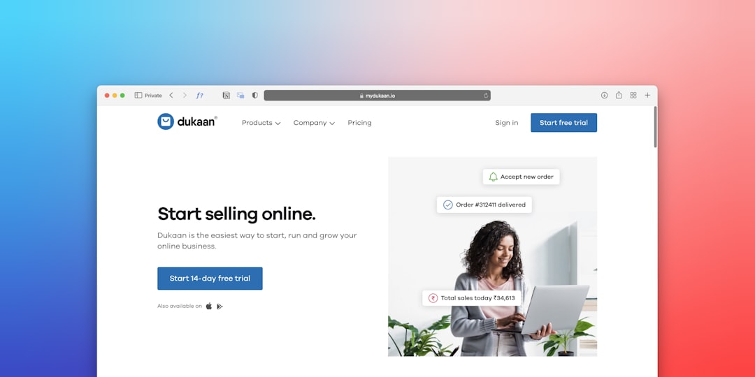
This technique is especially useful when a page has white or light-colored text. Instead of forcing designers to crop images awkwardly, the gradient creates a controlled reading zone. The strongest part of the overlay should sit behind the headline, subheading, and call-to-action button.
Conversion tip: The call to action should not compete with the image. A strong button color, such as green, orange, or white, can work well against a darkened background.
3. Radial Spotlight Gradient Behind the CTA
A radial gradient places light or color in a focused area and fades outward. When used behind a call-to-action section, it creates a subtle spotlight effect. The visitor’s eye naturally moves toward the brightest or most saturated point, which can help emphasize the main conversion action.
This idea works well near pricing blocks, email signup forms, webinar registrations, and product demo buttons. A soft glow behind the CTA can make the area feel important without adding arrows, flashing effects, or clutter.
- Use a gentle center glow rather than a harsh circle.
- Keep text on a solid contrast area to avoid eye strain.
- Match the glow to the brand palette for a cohesive look.
4. Brand-Tinted Gradient With Neutral Text Zones
Many landing pages use gradients to express brand personality. A brand-tinted gradient might blend purple with blue, coral with peach, or green with teal. While these combinations can look memorable, they must still leave room for readable content.
The most effective approach is to combine vibrant brand colors with neutral text zones. For example, a page might use a colorful gradient on the edges while keeping the center area darker, lighter, or more muted. This gives the design energy while allowing the message to remain clear.
Best for: creative platforms, tech startups, wellness brands, marketing services, and event landing pages.
5. Subtle Monochrome Gradient for Minimal Pages
Not every landing page needs a bold color blend. A monochrome gradient uses different shades of the same color, such as light gray to slate, pale blue to deep blue, or ivory to sand. This option supports a calm, premium look and keeps attention on the copy.
Minimal gradients are especially effective for pages that rely on credibility, data, or high-value offers. Since the background does not demand attention, the headline, proof points, and CTA can lead the visitor through the page more naturally.
Readability benefit: A monochrome gradient reduces visual complexity, making it easier for visitors to scan sections and absorb key details quickly.
6. Diagonal Gradient That Directs the Eye
A diagonal gradient can add motion and energy without animation. When the lighter area begins near the headline and travels toward the CTA, it creates a subtle visual path. This can help the page feel dynamic while guiding attention in a purposeful direction.

However, diagonal gradients should be handled carefully. If the transition is too strong, the background may distract from the message. The best versions use colors that are close in tone and preserve enough contrast behind all text elements.
Best for: app launches, digital products, fitness offers, online courses, and modern ecommerce campaigns.
7. Split Gradient for Product and Copy Balance
A split gradient separates the landing page into two visual zones. One side may be darker for text, while the other side may be lighter or more colorful for a product image, illustration, or interface preview. This layout is useful when the page needs to present both a strong message and a visual demonstration.
The split does not have to be harsh. A smooth blend between the two zones can feel more refined than a straight color block. The text side should maintain strong contrast, while the visual side can carry more color and detail.
Conversion advantage: This gradient style supports quick comprehension. Visitors can read the offer and understand the product almost simultaneously.
8. Bottom Fade Gradient for Scrolling Guidance
A bottom fade gradient darkens or softens the lower edge of a hero section, creating a gentle transition into the next part of the page. This helps signal that more content exists below the fold. It also prevents the hero from feeling visually disconnected from testimonials, feature lists, or pricing sections.
When used with a scroll cue, product preview, or partial section reveal, a bottom fade can encourage visitors to continue exploring. The gradient should not hide critical content, but it can add enough depth to make the page feel layered and intentional.
Best Practices for Gradient Readability
Gradients should support the message rather than compete with it. Designers and marketers often see better results when they treat the background as part of the conversion path, not just decoration.
- Prioritize contrast: Text must remain readable on every screen size.
- Test mobile layouts: A gradient that works on desktop may place bright colors behind mobile text.
- Limit color complexity: Two or three colors are usually enough.
- Use overlays when needed: Semi-transparent layers can stabilize busy backgrounds.
- Keep CTA buttons distinct: Buttons should not blend into the gradient.

FAQ
What type of gradient is best for landing page readability?
A soft vertical gradient, monochrome gradient, or dark overlay gradient usually works best. These options create depth while preserving strong contrast for headlines, body text, and buttons.
Can bright gradients reduce conversions?
Bright gradients can reduce conversions if they make content harder to read or distract from the call to action. They work best when used around the edges, behind illustrations, or in areas without important text.
Should landing page gradients match brand colors?
In most cases, yes. Brand-tinted gradients make the page feel consistent and recognizable. However, readability should come first, so brand colors may need to be softened, darkened, or paired with neutral zones.
How can a gradient make a CTA more noticeable?
A gradient can guide attention by using brightness, contrast, or direction. Radial spotlight gradients and diagonal gradients are especially effective for drawing the eye toward a button or signup form.
Are gradients suitable for mobile landing pages?
Gradients can work very well on mobile pages, but they must be tested carefully. Text placement changes on smaller screens, so designers should ensure that no bright or low-contrast area appears behind important copy.