
For SaaS developer tools, the hero section has a difficult job: it must explain a technical product quickly, earn trust from skeptical engineers, and create enough momentum for a signup, demo request, or trial start. A dark hero design can help because it feels focused, premium, and familiar to developers who spend much of their day in terminals, IDEs, dashboards, and documentation.
TLDR: Dark hero sections work especially well for SaaS developer tools when they combine clarity, contrast, and technical credibility. The best designs use focused messaging, realistic product visuals, strong calls to action, and subtle motion instead of decorative noise. To increase conversions, make the hero feel like a useful interface, not just a beautiful landing page.
1. The Terminal Inspired Hero
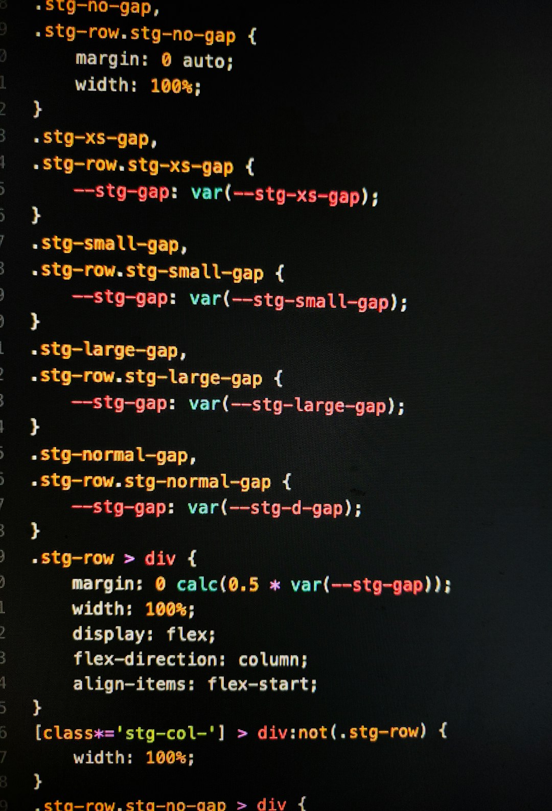
A terminal inspired hero is one of the most natural fits for developer audiences. It immediately signals that the product is practical, technical, and built for people who work with code. A dark background, monospace accents, and a command line style visual can make the experience feel familiar without requiring much explanation.
The key is to avoid turning the entire hero into a gimmick. Instead, use the terminal as a conversion device. For example, show a short command that installs your tool, followed by a realistic output that demonstrates value:
- Install command: quick setup creates a low barrier to entry.
- Successful output: implies reliability and speed.
- Next step prompt: guides users toward a free trial or documentation.
Pair the terminal visual with a headline that explains the outcome in plain language. Something like “Ship secure APIs in half the time” will usually outperform a vague line such as “Developer workflows, reimagined.” Developers appreciate cleverness, but they convert when the value is obvious.
2. The Product First Dashboard Hero
Many SaaS companies hide the actual product too far down the page. For developer tools, this can be a mistake. Engineers want to know what they are getting into before creating an account. A dark hero with a bright, detailed product screenshot can communicate functionality faster than a paragraph of copy.
This approach works best when the dashboard is not just pasted into the page. Use selective highlighting to guide attention: a glowing border around a deployment status, a highlighted error trace, or a small tooltip showing an automated recommendation. The dark background helps the interface feel sharper, while color accents draw the eye to the most valuable features.
To make this design convert, support the screenshot with a simple structure:
- Headline: describe the result users want.
- Subheadline: explain how the product creates that result.
- Visual proof: show the interface solving a real problem.
- CTA: offer a low friction next step, such as “Start free” or “View docs.”
A product first hero is especially effective for observability tools, database platforms, CI/CD products, API monitoring, feature flag systems, and security scanners.
3. The Neon Infrastructure Map
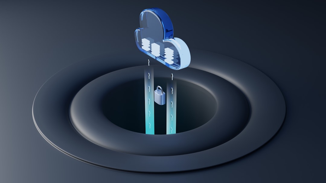
If your SaaS tool helps developers understand systems, services, dependencies, pipelines, or cloud infrastructure, a dark hero with a neon map can be highly engaging. Think of glowing nodes, connection lines, service clusters, and subtle movement that suggests live activity.
This idea works because it turns invisible complexity into something visual. A developer may not read every feature on the first visit, but they can instantly understand that your product brings order to distributed systems.
Use this design carefully. Too many glowing elements can look like a sci fi poster instead of a serious SaaS product. Keep the palette tight: deep navy or black backgrounds, one primary accent color, one secondary signal color, and plenty of negative space. The copy should bring the visual back to a business outcome, such as:
- “See every service dependency before it breaks production.”
- “Debug distributed systems from one live map.”
- “Understand your cloud stack in minutes, not days.”
4. The Code Plus Outcome Split Hero
A strong dark hero section can bridge two worlds: the developer’s workflow and the business value your product creates. A split layout is ideal for this. On one side, show code, configuration, logs, or an API request. On the other side, show the outcome: faster builds, fewer incidents, improved performance, or successful deployment.
This format is powerful because it answers two conversion questions at once. The technical side says, “Yes, this fits your workflow.” The outcome side says, “Yes, this is worth adopting.”
For example, an API platform could show a code snippet on the left and a clean response preview on the right. A testing tool could show a failing test being detected, then a confidence score improving. A deployment tool could show a configuration file next to a successful release timeline.
To increase conversions, keep the hierarchy simple. The code visual should be legible but not overwhelming. The outcome should be emotionally satisfying: a green success state, a shorter timeline, or a metric that improves. Developers do not need exaggerated claims; they need believable progress.
5. The Security Focused Dark Hero
Dark designs are especially effective for developer security tools because they create a sense of seriousness and control. However, security pages often fall into the trap of fear based messaging. While urgency matters, conversion improves when the hero communicates confidence rather than panic.
A good security focused hero might use a dark background, subtle grid lines, shield or lock motifs, and a live scan interface. The headline should focus on preventing risk without slowing teams down. For example: “Find vulnerable dependencies before they reach production.” That line is specific, useful, and tied to a workflow developers understand.
Excellent supporting elements include:
- Trust indicators: compliance badges, encryption notes, or customer logos.
- Technical proof: scan speed, supported languages, or integration list.
- Low risk CTA: “Scan your repo” is often stronger than “Book a demo.”
The dark aesthetic should make the product feel stable, not mysterious. Avoid overly dramatic hacker imagery unless your brand can genuinely support that tone.
6. The Documentation Led Hero
For many developer tools, documentation is part of the product experience. If your docs are excellent, put them in the hero. A documentation led dark hero can show a search bar, quickstart steps, code examples, and navigation in a clean interface that resembles a technical knowledge base.
This design idea increases conversions by reducing perceived effort. Developers often hesitate because they wonder how hard implementation will be. A hero that says “Get started in five minutes” and then visually proves it with three clear steps can be very persuasive.
Make sure the CTA matches the intent. Instead of only pushing a sales oriented action, offer routes such as:
- “Read the quickstart”
- “Try the API”
- “Install the SDK”
- “Explore examples”
This is particularly useful for API products, SDKs, open source commercial tools, authentication platforms, and infrastructure utilities. If developers can learn before committing, they are more likely to trust the product.
7. The Minimal High Contrast Hero
Not every dark hero needs complex visuals. Sometimes the highest converting option is a minimal layout with sharp copy, a strong CTA, and one precise proof point. This works well when your audience already understands the problem and needs a reason to choose you.
A minimal dark hero usually includes a black or charcoal background, crisp white typography, one bold accent color, and generous spacing. The headline should be direct. The subheadline should explain differentiation. The CTA should be impossible to miss.
For example, a developer analytics tool might use:
- Headline: “Analytics built for engineering teams.”
- Subheadline: “Track API usage, latency, and developer adoption without stitching together five tools.”
- CTA: “Start free”
- Proof: “Processes 2 billion events monthly.”
The power of this approach is restraint. With fewer elements, every word matters more. It feels confident, and confidence is persuasive.
Conversion Details That Make Dark Heroes Work
Regardless of which concept you choose, the details determine performance. Dark hero sections can look beautiful but fail if contrast is weak, the CTA disappears, or the message is too abstract. Developers are not impressed by vague futurism. They respond to clarity, speed, compatibility, and evidence.
Use these principles to improve conversions:
- Prioritize readability: use high contrast text and avoid thin gray copy on black backgrounds.
- Make CTAs specific: “Deploy a test app” can outperform “Get started.”
- Show real workflows: screenshots, code, logs, and docs feel more credible than generic illustrations.
- Reduce friction: mention free trials, no credit card requirements, or quick setup when true.
- Add proof near the CTA: customer logos, uptime stats, GitHub stars, or integration counts can reduce hesitation.
A dark hero section is not just a visual style. For SaaS developer tools, it is a way to create focus, communicate technical depth, and guide visitors toward action. When the design mirrors the environments developers already trust and the message clearly explains the benefit, the hero becomes more than an introduction. It becomes the first convincing product experience.